(function() {
// 1. Create a list of domains we want to "Blacklist"
const blacklist = ['idlp.cloud', 'datasdk.ai', 'leadpipe.com'];// 2. Intercept the moment a script is added to the page
const originalAppendChild = Element.prototype.appendChild;Element.prototype.appendChild = function(child) {
if (child && child.tagName === 'SCRIPT') {
const source = child.src || '';
// If the script source matches our blacklist, kill it
if (blacklist.some(domain => source.includes(domain))) {
console.warn('Prevented LeadPipe from loading:', source);
return child; // Return the element but don't actually add it to the DOM
}
}
return originalAppendChild.apply(this, arguments);
};// 3. Stub the global variables just in case
window.leadpipe = function() { return false; };
window.pixelsdk = function() { return false; };
})();
The Next Evolution of Modern Customer Journey Visualization
Picture this: You oversee the Southeast region for a national retail chain and regularly tap into customer journey visualization tools to know what your buyer needs. A hurricane is about to hit the area you manage and you need to stock up on food before the storm arrives. Without any insights, you might assume customers in that area will flock to the stores to stock up on essentials like milk and eggs but you’d be wrong. The data shows people in the target zone for a natural disaster opt for non-perishable items, such as Pop-Tarts and liquor instead. That’s even if they shop at all. The reason? People are emotional creatures and consuming comfort food tends to help people feel better as the sky falls around them. Knowing this one insight lets you stock what people want, giving your customers a better experience with your brand.
In Salt Lake City, we’re fortunate to be immune from hurricanes, but that doesn’t mean we’re not fascinated by consumer behavior in just about all situations. We’re the creative designers and UX/UI specialists on the RocketSource team and it’s our job to visualize both the company’s message to our clients and the customer’s journey to internal stakeholders. That internal visualization isn’t as easy as it once was because today’s modern consumer journey looks vastly different than what it did five years ago.
Digital Transformation Has Fragmented the Modern Customer’s Journey
It’s fascinating to watch how society continues to evolve, specifically as today’s ecosystem becomes more digital-centric. This video describing the micro-moments buyers encounter every day is a prime example of how reliant consumers have become on the Internet.
It’s not just search engines seeing this level of engagement either. The cloud Internet of Things has changed how we perform even the most basic of tasks, such as turn on lights. We’re wearing devices that allow us to get a deeper understanding of our overall health. We can now talk to a speaker sitting on the kitchen counter to do our shopping, changing the very nature in which we buy everyday items.
Still, no matter how much we, as buyers, interact with digital channels, there will always be a need for the physical. The difference today is how people interact with a variety of channels while shopping. The concept of blending the customer journey both online and offline is known as omni-channel.
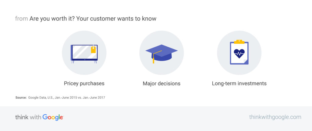
Consumers often turn to Google from their mobile device when making logical decisions about a purchase. For example, searches for the term “is X worth it” grew by 80% on mobile devices from 2015 to 2017.
Searches like these typically happen when the purchase is substantial, for example when a consumer is buying electronics. But they can also happen when a buyer is purchasing speciality items, such as organic milk or synthetic oil. Brendan Miller, a principal analyst at Forrester took this a step further and found that buyers are multitasking between digital and physical platforms while shopping in traditional brick-and-mortar stores. They’re using mobile channels to make in-store price comparisons and research brands. It’s this type of multitasking and omni-channel behavior that must be accounted for when visualizing your buyer’s journey.
But channels aren’t the only thing that have changed. What happens between a customer and a business after the purchase has evolved too.
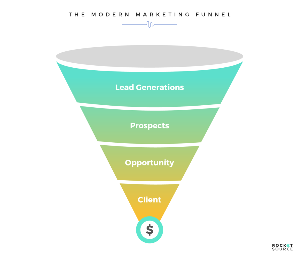
Reshaping the Modern Marketing Funnel
Marketers often refer to the marketing funnel when talking about how to convert leads and prospects into buyers. Traditionally this funnel starts with a wide brim full of people who are interested in the product. As the cone narrows, so do the amount of people who are likely to buy.
Ultimately, the bottom of the cone represents the customers who buy. It’s at this point where most marketing funnels stop. The customer finalized the transaction, and for all intents and purposes, the customer’s journey with the brand is done.
This type of funnel does not work with the more detailed path-to-purchase of today’s modern consumer. Marketers today are starting to look beyond the initial transaction and pay closer attention to how to retain consumers, avoiding costly churn and simultaneously building a base of brand ambassadors.
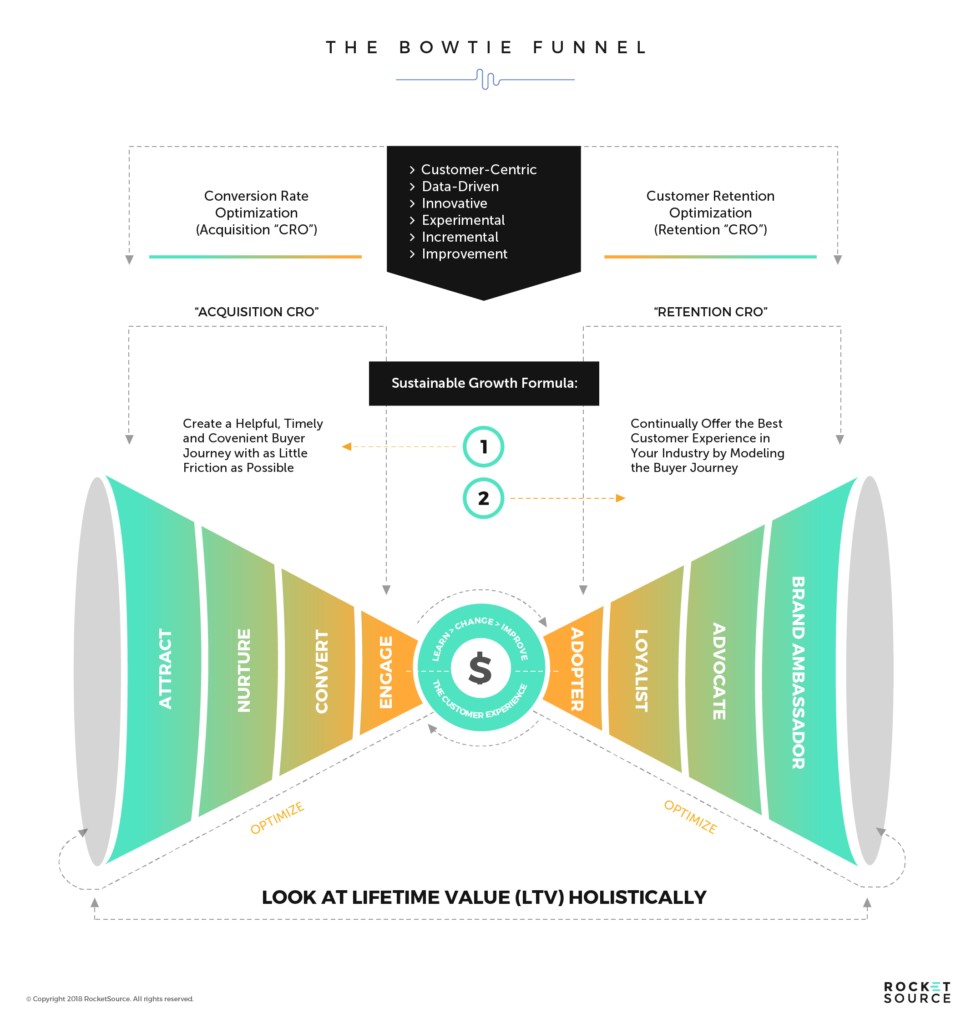
To showcase both conversion rates and customer retention rates we’ve taken a different spin on visualizing the marketing funnel. Here’s what it looks like today.
This is called the Bow Tie Funnel because of its shape. The left side gets a little more detailed than traditional marketing funnels, looking closer at the various stages of the buyer’s journey — attracting leads, nurturing potential buyers along their journey, converting prospects into customers, and then engaging buyers with brief follow up emails or direct mail thanking them for the purchase. Traditionally that’s when the customer’s journey ends in the eyes of a business, but reality shows that’s not the case.
On the right side of this modern marketing funnel, you’re able to see what the customer believes happens after the purchase and the potential for a deeper relationship. By optimizing their experience after the purchase, businesses increase retention rates and move customers from an adopter of the brand to a brand ambassador.
Understanding this full end-to-end journey, and how it loops back to the beginning to continually engage buyers, is critical when it comes to modern customer journey visualization. Equally critical is the lens in which you design these visual aids and communicate the journey across your organization.
The Importance of Having a Framework for Customer Journey Visualization
At RocketSource, the framework we use to guide our approach to customer journey visualization for ourselves and for our clients is StoryVesting — the brainchild of my partner Buckley Barlow. This framework is often referred to as the “why” framework because it centers on the vision and purpose of the business aligning with the “why” of the power user or consumer. That relentless focus is by design.
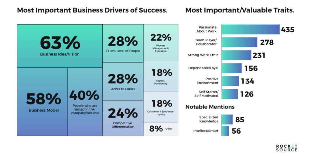
When Buckley Barlow, one of the co-founders at RocketSource, developed the StoryVesting framework, he started by conducting a wealth of research. He started by seeking out people with proven track records of success, such as Eric Schmidt, the former CEO of Google Alphabet, and Gene England of England Trucking. While talking to these people, he was referred to other people who were considered equally successful. His research quickly evolved and soon he had interviewed 1,969 people who had the background and endorsements to prove they knew a thing or two about success.
One of the questions he asked to everyone he spoke to was this: what are the key drivers to making an organization successful, both from a team and a company perspective?
In analyzing the results of his research, Buckley found something key. 63% of the people he spoke to said the top driver of organizational success was the business’s idea and vision.
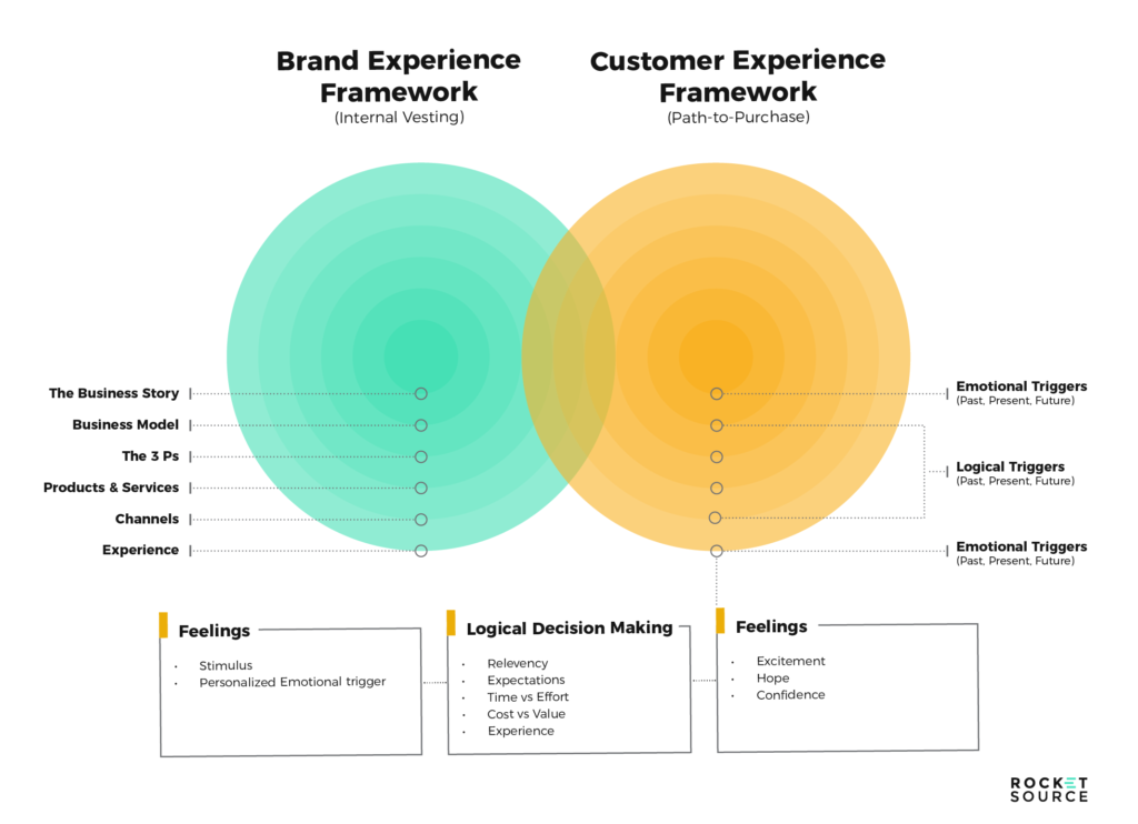
It was this top response that became the crux of the StoryVesting framework. As Buckley developed the framework, it evolved over time. Still, in each version, the company’s vision, why, and story were a focal point. After several iterations, Buckley landed on the framework we use today, which looks like this.
If you’re not familiar with the intricacies and nuances of this framework yet, we urge you to devote some time to reading Buckley’s post on the business transformation framework. For the sake of this post, we’re focusing more specifically at the center — the business’s story and how it relates to the customer’s journey. Just keep in mind that the StoryVesting framework is the foundation for the other frameworks and methodologies he developed like the BowTie Funnel, Customer Journey Map, Empathy Map, CX/EX Radar Graph, Convergence/Divergence, Modified Hoshin and the Business Impact Analysis Graph to name a few. Needless to say, he’s been busy and the research has been deep and extensive.
As designers, it’s our job to visualize and communicate the “Why” both internally and externally. Employees and customers alike rely on visual aids and clear visual communications to clarify what’s happening along the buyer’s journey and ensure the journey aligns back with the organization’s why. The only way to achieve this is by knowing and internalizing that vision. As creative designers, not understanding and internalizing that vision is a huge missed opportunity for growth.
To get this right, we’ve focused our efforts on evolving how we visualize what’s happening along the customer’s journey. In doing so, we’ve deepened the insights we’re able to deliver to our clients and our team. The byproduct of this has been better customer experience scores and bigger ROI on growth marketing initiatives for us and our clients.
If you’re in creative design tasked with user experience (UX) or the user interface (UI), you’re the core player in communicating the company’s story amidst the modern consumer shifts via a visual medium. Here’s how we’ve iterated on traditional mechanisms to convey a deeper story about today’s consumer.
The Evolution of Customer Journey Visualization
Along with the evolution of the modern consumer, and through the lens of the StoryVesting framework, we’ve innovated on traditional styles of customer journey visualization. Specifically, we’ve adopted empathy maps that never got used and the customer journey maps that didn’t tell the full story. Here’s how.
Updating the Old Empathy Map
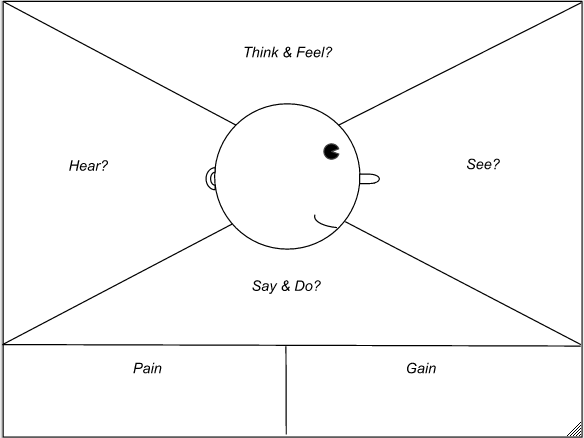
Many businesses have used empathy mapping as a means for understanding the people buying their product. Traditionally this empathy map breaks out what people are thinking, feelings, saying and doing while making a purchase. Likewise, it looks at the buyer’s pains and what they stand to gain when making a purchase. It typically looks something like this empathy map from Solutions IQ.
There’s nothing inherently wrong with this empathy map. Still, it lacks the type of depth needed to truly understand what’s happening holistically with today’s modern buyer.
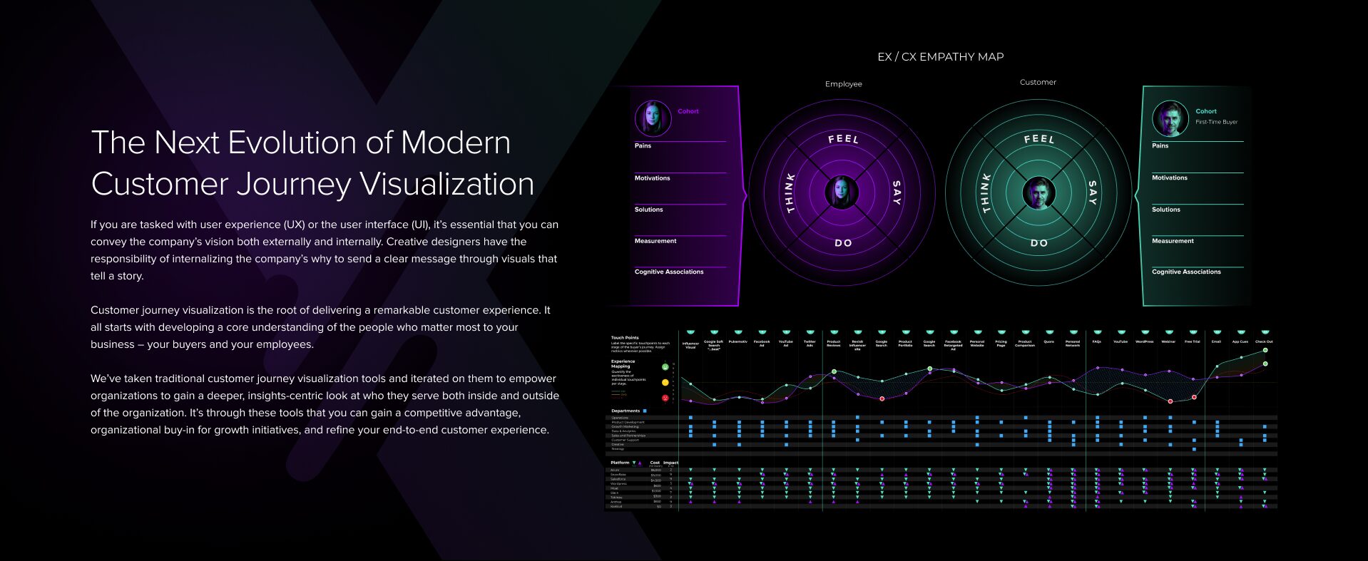
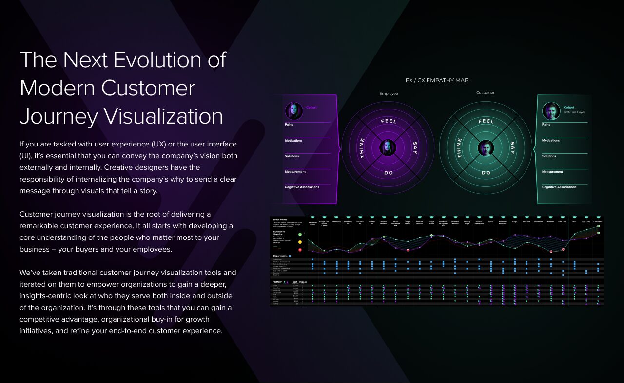
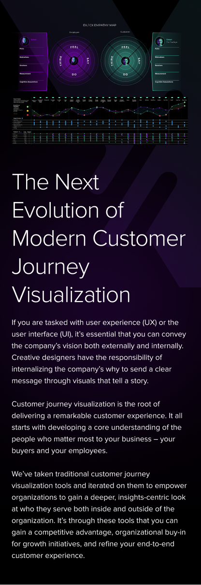
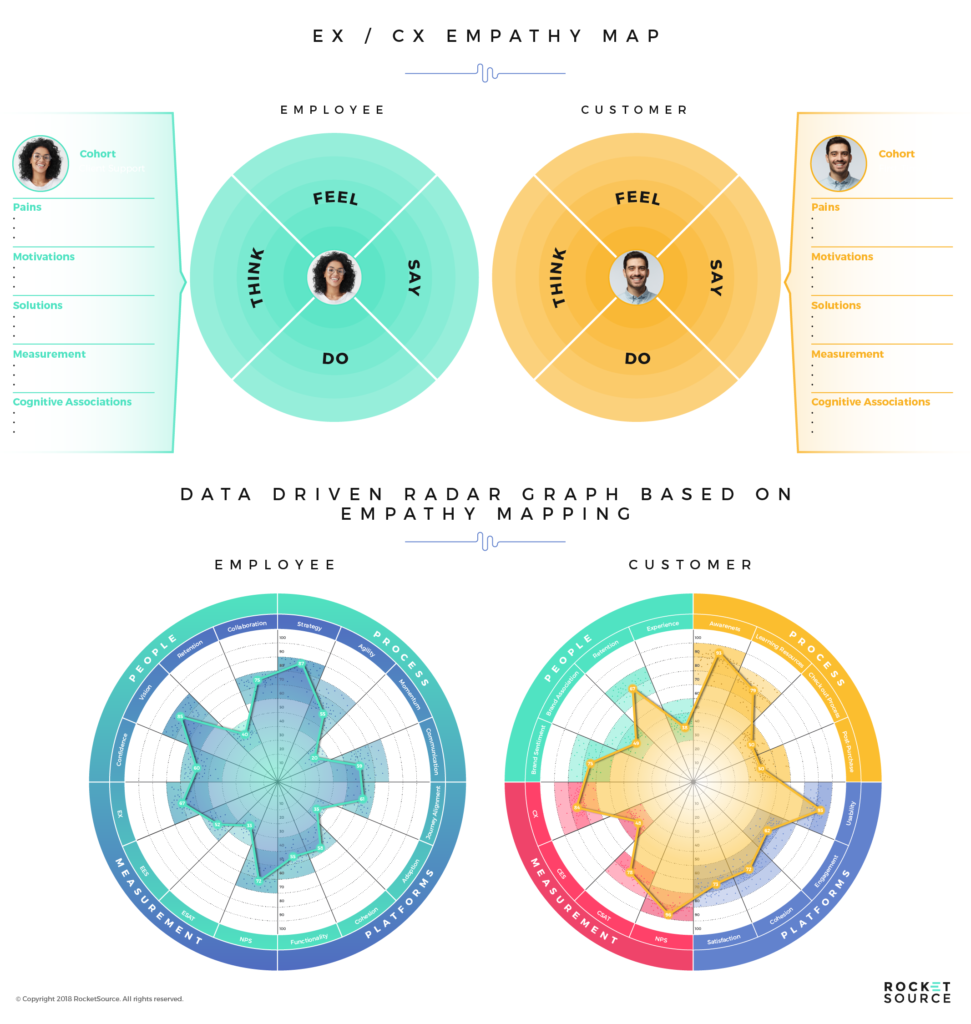
To iterate on this traditional version, we added three new elements — two empathy maps, three new sections, and 32 data points to draw insights (after all, we are a Data as a Service provider). Today, it looks like this.
There’s good reason for this evolution and these additions.
The first thing you’ll notice is that there are two empathy maps here. The empathy map in blue represents the employee’s experience with the brand. The empathy map in orange represents the customer’s experience.
Both experiences influence one another. If people are unhappy at work, they will become disengaged. That lack of passion and drive will ultimately influence the customer’s experience. If customers are unhappy and not having their needs met, employees will not enjoy their job and you’ll lose business.
By taking the same empathetic stance toward your employees as you do your customers, you improve the overall experience with your brand, both inside and outside your firm.
The second thing you’ll notice is that we added a section for solutions and measurement. The challenge with traditional empathy maps is they aren’t actionable. There are plenty of big-picture concepts presented but it takes creativity to draw from the findings and turn it into something that can help grow your business.
To change that, we added three sections:
Solutions
Motivations
Cognitive Associations
Each of these areas gives more insight and depth into what brands can do to operate in a more empathetic way. The solutions offer actionable steps that can be taken to move the needle forward. Motivations get more specific into the emotional and logical triggers that make a person want to make a purchase. The cognitive associations get deeper on what people think of the brand, so businesses can avoid creating dissonance.
That last part is critical. Buckley Barlow went into detail on what cognitive associations are and why they matter on his post about how he developed the business transformation framework, StoryVesting. If you’re new to them, we urge you to head over and skill up in that area as these associations influence how you visualize your customer’s journey.
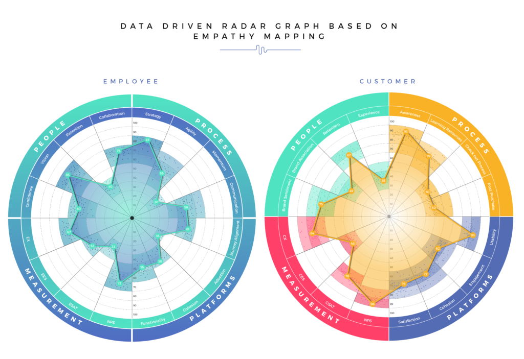
Finally, the final big differentiator here, are the added data-driven radar graphs at the bottom. Here, we plot 16 data points about the employee and 16 data points about the customer to visualize where a company excels and opportunities for improvement.
We chose to plot out these data points on a radar graph because it lets us quickly look at multiple variables at once. By regularly updating these radar graphs, we can be alerted when something is amiss and make quick changes to remedy a situation.
Empathy maps offer quick insights into where and how we can excel. Then, by taking these insights and plotting them a customer journey map (or what we’ve renamed to a customer insights map), we can gain a deeper understanding of what happens at each stage of the buyer’s journey and how we can use these findings to improve the overall experience.
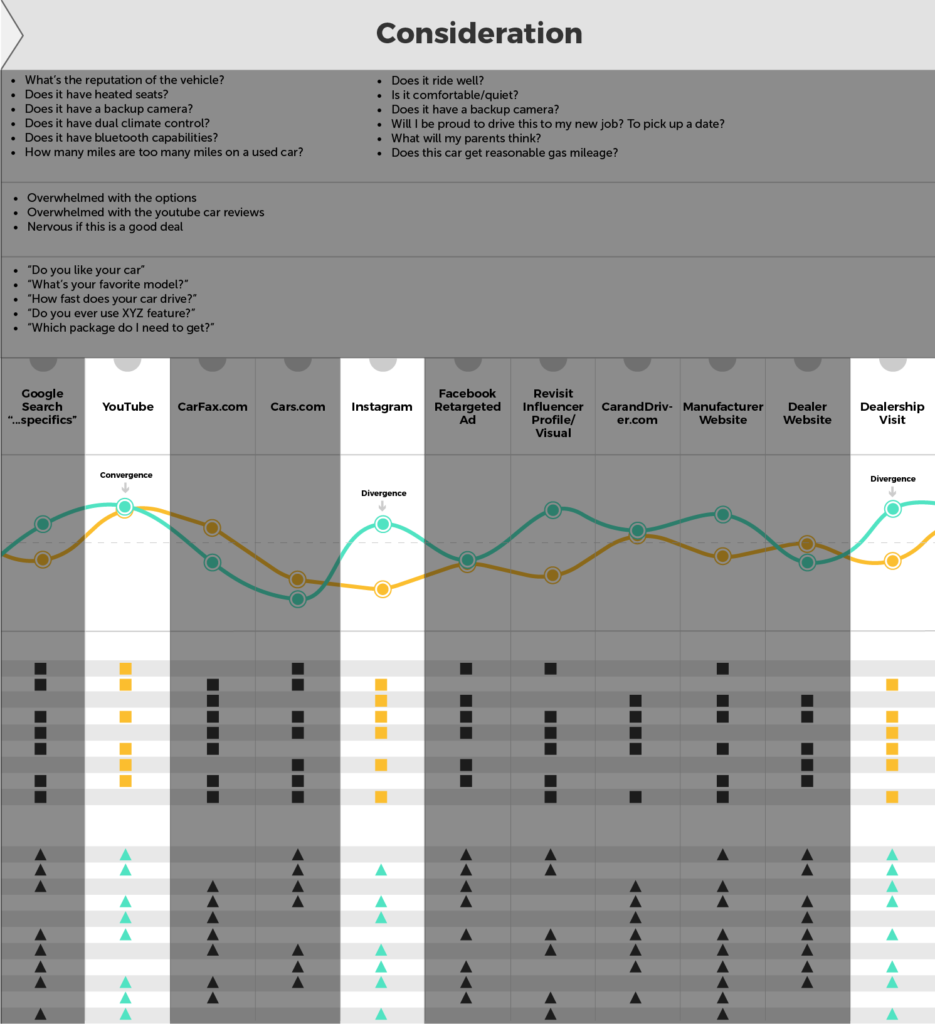
Reimagining the Traditional Customer Journey Map
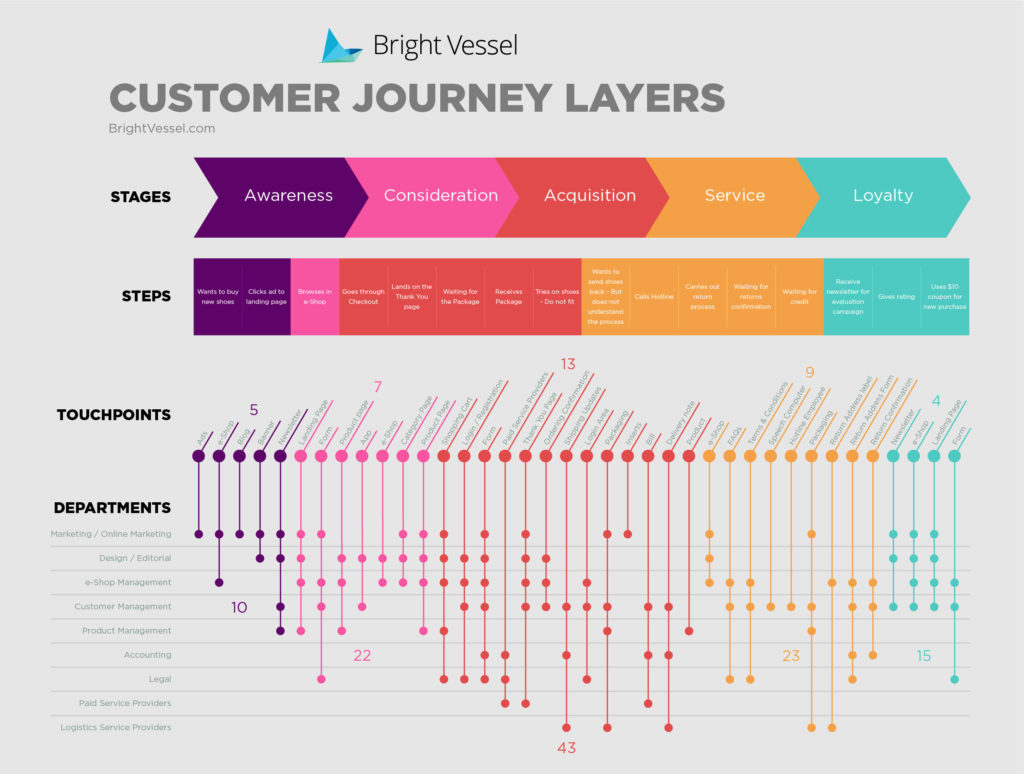
For several years, marketers have plotted out the progression a buyer takes from start to finish along his or her journey toward purchase. Traditionally, these maps are broken up into the various stages of the buyer’s journey and look at the touchpoints along the way, as well as the departments that engage with the buyer at each stage. They look something like this customer journey map from Bright Vessel.
This map is beautifully designed but it lacks the appropriate amount of depth needed to understand what’s happening from the awareness stage, through engagement and beyond.
Like many other traditional customer journey maps, we’re all about actionable insights and alignmentand so together with many members of the RocketSource team, we’ve built what we think is the most powerful and insightful journey map on the market, aptly called the Customer Insights Map (CIM). After all, isn’t that what we’re going for? Insights? Customer Insights? Like we did with the empathy maps, we’ve applied journey analytics to the customer journey map to make it rich with actionable insights and clear opportunities. It looks something like what you see here.
This is only a snippet of our reimagined CIM because the full version is only available through the RocketSource training programs. Still, we wanted to share with you a few of the key additions that make this come to life.
First, we merged the empathy map with the CIM bringing in the customer’s thoughts, feelings, and what they’re saying at each stage of the journey. This approach adds another layer of depth to the traditional empathy map.
We also added experience scores to make this map insights-centric instead of relying solely on guesswork. The blue line seen in the image above represents the employee’s experience score at each touchpoint. The orange line is the customer’s experience. This approach makes it easier to quickly see large gaps or low scores, showing specifically where you should focus your efforts.
What’s not pictured here are the added metrics to the path-to-purchase. We’ve taken the net promoter score (NPS), customer satisfaction score (CSAT), and customer effort score (CES) and applied each to the various stages of the path-to-purchase. Then, we break out how much various paths earn for the business, the timing, and other metrics that empower businesses to make better decisions about where to invest spending.
When each of these elements are added to the traditional customer journey map, you’re better able to visualize opportunities and make better decisions about where and how to spend your money.
Bringing it All Together
When you look at the way modern consumers’ buying habits have changed over the past decade, it’s clear that the way we visualize their journey needs to change too. Updating customer journey visualizations shouldn’t happen via guesswork, however. It should be done via a reliable framework and infused with the insights available from data.
That was our approach when we iterated on these two common visualization tools. By using StoryVesting as our guide, we were able to deepen the approach, making the takeaways more actionable and effective.
Ready to do the same for your team? Schedule a complimentary consultation, and we will guide you through the next steps for bringing StoryVesting to your organization.
var mejsL10n = {"language":"en","strings":{"mejs.download-file":"Download File","mejs.install-flash":"You are using a browser that does not have Flash player enabled or installed. Please turn on your Flash player plugin or download the latest version from https://get.adobe.com/flashplayer/","mejs.fullscreen":"Fullscreen","mejs.play":"Play","mejs.pause":"Pause","mejs.time-slider":"Time Slider","mejs.time-help-text":"Use Left/Right Arrow keys to advance one second, Up/Down arrows to advance ten seconds.","mejs.live-broadcast":"Live Broadcast","mejs.volume-help-text":"Use Up/Down Arrow keys to increase or decrease volume.","mejs.unmute":"Unmute","mejs.mute":"Mute","mejs.volume-slider":"Volume Slider","mejs.video-player":"Video Player","mejs.audio-player":"Audio Player","mejs.captions-subtitles":"Captions/Subtitles","mejs.captions-chapters":"Chapters","mejs.none":"None","mejs.afrikaans":"Afrikaans","mejs.albanian":"Albanian","mejs.arabic":"Arabic","mejs.belarusian":"Belarusian","mejs.bulgarian":"Bulgarian","mejs.catalan":"Catalan","mejs.chinese":"Chinese","mejs.chinese-simplified":"Chinese (Simplified)","mejs.chinese-traditional":"Chinese (Traditional)","mejs.croatian":"Croatian","mejs.czech":"Czech","mejs.danish":"Danish","mejs.dutch":"Dutch","mejs.english":"English","mejs.estonian":"Estonian","mejs.filipino":"Filipino","mejs.finnish":"Finnish","mejs.french":"French","mejs.galician":"Galician","mejs.german":"German","mejs.greek":"Greek","mejs.haitian-creole":"Haitian Creole","mejs.hebrew":"Hebrew","mejs.hindi":"Hindi","mejs.hungarian":"Hungarian","mejs.icelandic":"Icelandic","mejs.indonesian":"Indonesian","mejs.irish":"Irish","mejs.italian":"Italian","mejs.japanese":"Japanese","mejs.korean":"Korean","mejs.latvian":"Latvian","mejs.lithuanian":"Lithuanian","mejs.macedonian":"Macedonian","mejs.malay":"Malay","mejs.maltese":"Maltese","mejs.norwegian":"Norwegian","mejs.persian":"Persian","mejs.polish":"Polish","mejs.portuguese":"Portuguese","mejs.romanian":"Romanian","mejs.russian":"Russian","mejs.serbian":"Serbian","mejs.slovak":"Slovak","mejs.slovenian":"Slovenian","mejs.spanish":"Spanish","mejs.swahili":"Swahili","mejs.swedish":"Swedish","mejs.tagalog":"Tagalog","mejs.thai":"Thai","mejs.turkish":"Turkish","mejs.ukrainian":"Ukrainian","mejs.vietnamese":"Vietnamese","mejs.welsh":"Welsh","mejs.yiddish":"Yiddish"}};
//# sourceURL=mediaelement-core-js-before
var QodeAdminAjax = {"ajaxurl":"https://www.rocketsource.com/wp-admin/admin-ajax.php"};
var qodeGlobalVars = {"vars":{"qodeAddingToCartLabel":"Adding to Cart...","page_scroll_amount_for_sticky":"","commentSentLabel":"Comment has been sent!"}};
//# sourceURL=bridge-default-js-extra